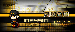
Forum signature tutorial... Example 1
Friday, April 13, 2007
Ok guys, since its a weekend without much crappy homework, we can put up a forum signature, a.k.a. siggy, tutorial. If you don't know what is a forum siggy, it is something pepople put at the end of every of their forum posts. Even you don't have a need to make 1, just read on... because you can learn some stuff out of it.
We know that everyone has their own style. Retro, grunge, natural, 3d, pastel, cute... you name it. But for this tutorial, we will touch on a bit of a techy and trendy style. Well, this was made for a friend some time ago when he was playing maplestory, some not so popular game now... but who cares? We are here to teach you graphics, not talk about games. Now lets take a look at the pic 1st.

Well, it make look like quite complicated. But we will again make things as simple as we can. In this signature, we use some cheap, makeshift methods. After seeing tutorials and people who do things in "professional" style, we decided to show you how simple methods are cool as well. Anyway, who cares about doing things the proper, pro-like way all the time? All we want is something nice, right?
Note: This tutorial requires some basic knowledge of paint shop pro, or if you use photoshop, know how to do the basics. (eg. using text, erasers, brush textures, duplicating layers). If you don't know, look it up in the help section of the program you are using. Besides, you need some thinking of your own to complete this tutorial. Afterall, if you are smart enough to read this blog, you should be able to understand.
1st, we make a new image in paint shop pro, 300x130 pixels. Kinda small, cuz of forum limitations, and you may wanna type some text after your pic.
2nd, we took a screen shot of a visualization in winamp (ctrl + prtl scrn, then paste in your graphic program), our favorite media player. If you are using windows media player, fear not. Winamp is free for all, and i recommend you to download it. We like to use it to generate nice looking backgrounds using a visualization plugin called r4. Winamp users can download the plugin form winamp.com by searching for r4 in the visualization section.
3rd, we paste the screen shot in paint shop pro, then we drag it so that we can only see the visualization effect.
4th, Convert the selection to a layer. Then duplicate it. Apply a motion blur. Use an eraser at around a size of 70-100 and hardness at 0 and erase the center parts so that only the borders have the motion blur. Use a paint brush, with color as black and texture as grid, to brush slightly around the edges. The screen shot shows how we set our brush in paint shop pro and what we achieved after erasing and brushing.
5th, we made some arial text in a large size, with the text body color as transparent and the line color as yellow. We set it as a layer and duplicate it again. Then we go to the layer below and apply a motion blur with a strength of 30.
6th, After that, we make some rectangles in a new layer. And make text in another new layer and blur it. The text is arial and is black now. We made the two new layers slightly transparent.
7th, we create a new layer and make some yellow rectangles in a nice, tech like position. We add some arcs made by showing part of large circles. Remember to turn on anti-alias for all the shapes in this tutorial, for easy viewing. You can check out what we mean in the screenshot.
8th, we have to create a black box for the text. We do this a rectangle across in another new layer. Besides, we add a few lines along the bottom of the pic and above the box.
9th, we use a circle brush of size about 60-80, black color, hardness 0, and brush the sides a bit to create a "shady" feeling. Then, we created some micro text on the top left in another layer and duplicate it, then motion blur it with a strength of 75. Then, we drew some intersecting lines of width 1.5 to give it a more "techy" look as well as anti-aliasing it.
10th, we go make a new layer and make a yellow rectangle across, and a smaller one below. We can select a bit of the small rectangle in the bottom right and delete them, cutting squarish parts out of the rectangle, thus making a "techy" feeling. Use an circle eraser of hardness 0, and erase parts of the small rectangle to make it slightly translucent. You should be able to know what we mean by examining out screenshot carefully.
Now, we've completed the background! Feel happy for yourself. We hope that you have learnt some new techniques and effects (eg. like duplicating text layers and motion bluring the bottom one; brushing the sides in a darker color to make the pic "shady"). In the following steps, we will learn how to put the image and text in an attractive way. :)
11th, we copy the image of the character and clean up the background by using the magic wand tool to select spots of background and deleting them. Then we select the cleaned-up character image using the magic wand tool and apply a drop shadow effect, opacity 90, horizontal 2, vertical 2.
12th, remember how you apply the motion blur effect to the text in the previous steps? Now, instead of motion blur, we gonna use the wind effect after duplicating the text layer, as it gives a nicer finish in this case. In paint shop pro, it can be found under effects> distortion> wind. After applying the effect, we lowered the transparency of the layer that we applied the effect. The font we use is called hooge 05_53. You can download it at http://wint.virtualplastic.net/download/font.zip.
13th, or the last step. We added the pics of the skills of the character. For this example, we cleaned it like what we did to the character, invert the colors, and added a drop shadow effect. We added some small text on the right in a new layer and duplicated the layer and Gaussian blurred it at a strength of 2.
With this, this tutorial is completed. While we don't expect you to use exactly our style, our main purpose of putting up this tutorial is to let readers learn some effect techniques and how to use shapes and text to convey the feeling you want to let your pic have. You can try to use other visualizations in your desired color and some other interesting shapes combinations. Maybe next time, we can make a tutorial about grunge signatures.

Labels: Graphic Tutorials


<< Home